

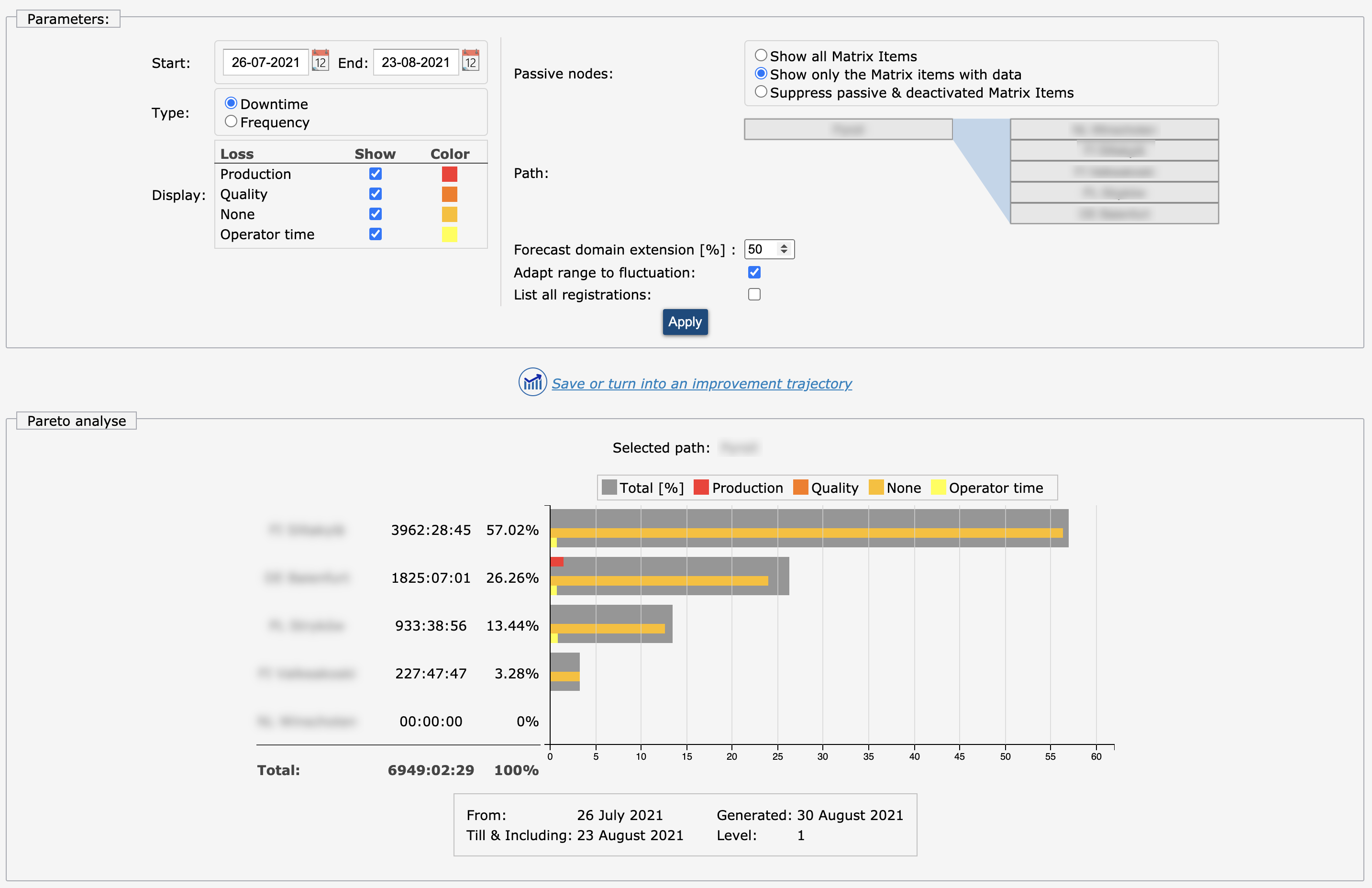
When analyzing, the Pareto graph sorts your root-cause failure tree based on duration or frequency. Starting at a high level, the bar graph indicates the magnitude of downtime or frequency. By clicking a specific bar, one zooms in until you get to the root cause. Management can simply identify different bottlenecks and determine which one needs to be improved first.
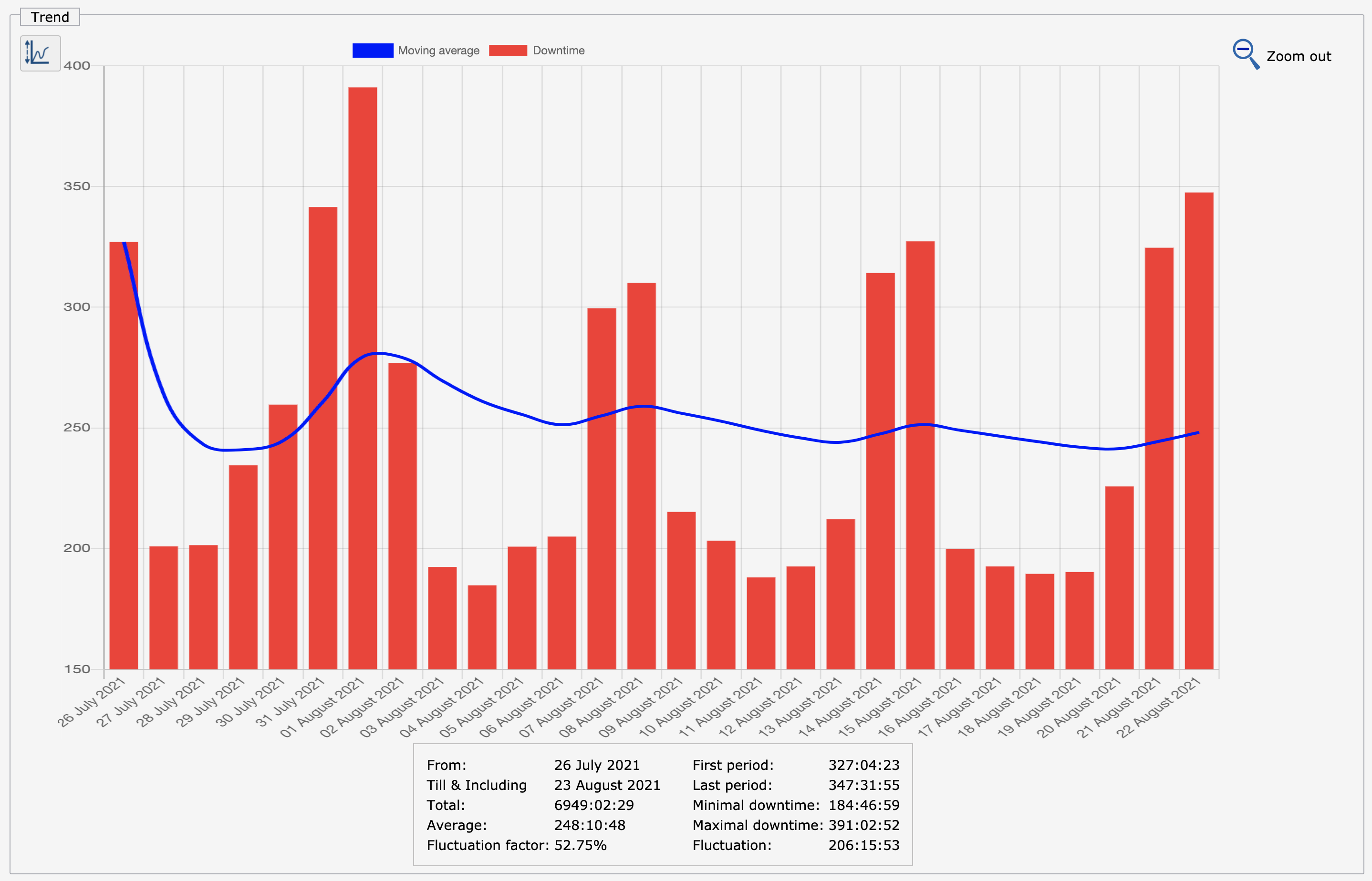
The trend analysis shows the development of the downtime or frequency. This is useful to monitor the effect of preventive measures. Directly on improvements taken, it is common to see an upward trend on this issue before the desired effect sets in. Employees are paying more attention to that particular problem, the so called Baader-Meinhof phenomenon, or it takes time for them to get used to a new working practice. If after a while, the desired downwards trend does not set in, management has to reconsider their actions.
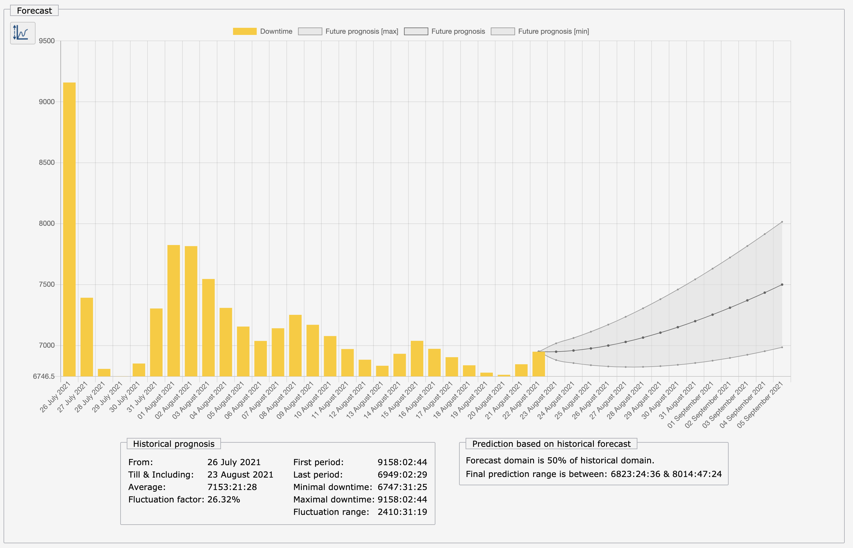
The prediction graph helps one to identify rapidly developing problems that are currently still minor but will become major if no interference takes place.
Use the item analysis for asset management and generate reports about specific parts or problems in your production or logistical process.